
Update the WGU Student mobile app to increase student momentum (a measure of attainment for student progress), create a seamless experience across screens, and add a dark mode experience.
Outcomes
• Increased student engagement from 56% to 78% of students actively using the WGU app over a year.
• Rage taps on the homepage reduced by 2/3 and added notifications with elevated CTAs for students.
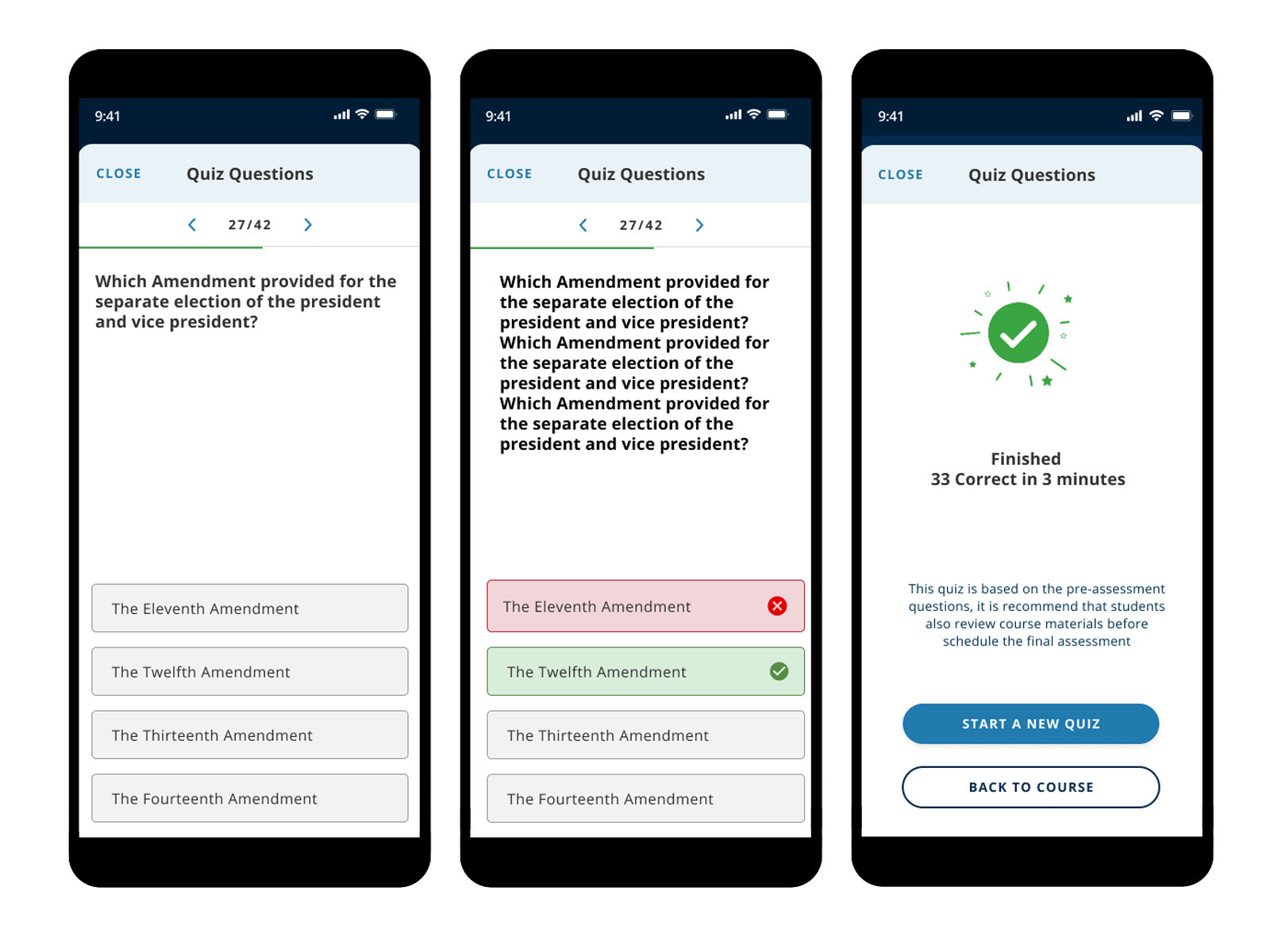
• The Quiz Me feature resulted in an 8% increase in momentum for students (the largest increase for a single feature) and a 3-minute increase in engagement time on the app.
Lead UX Designer executed User Experience and Interaction Design.
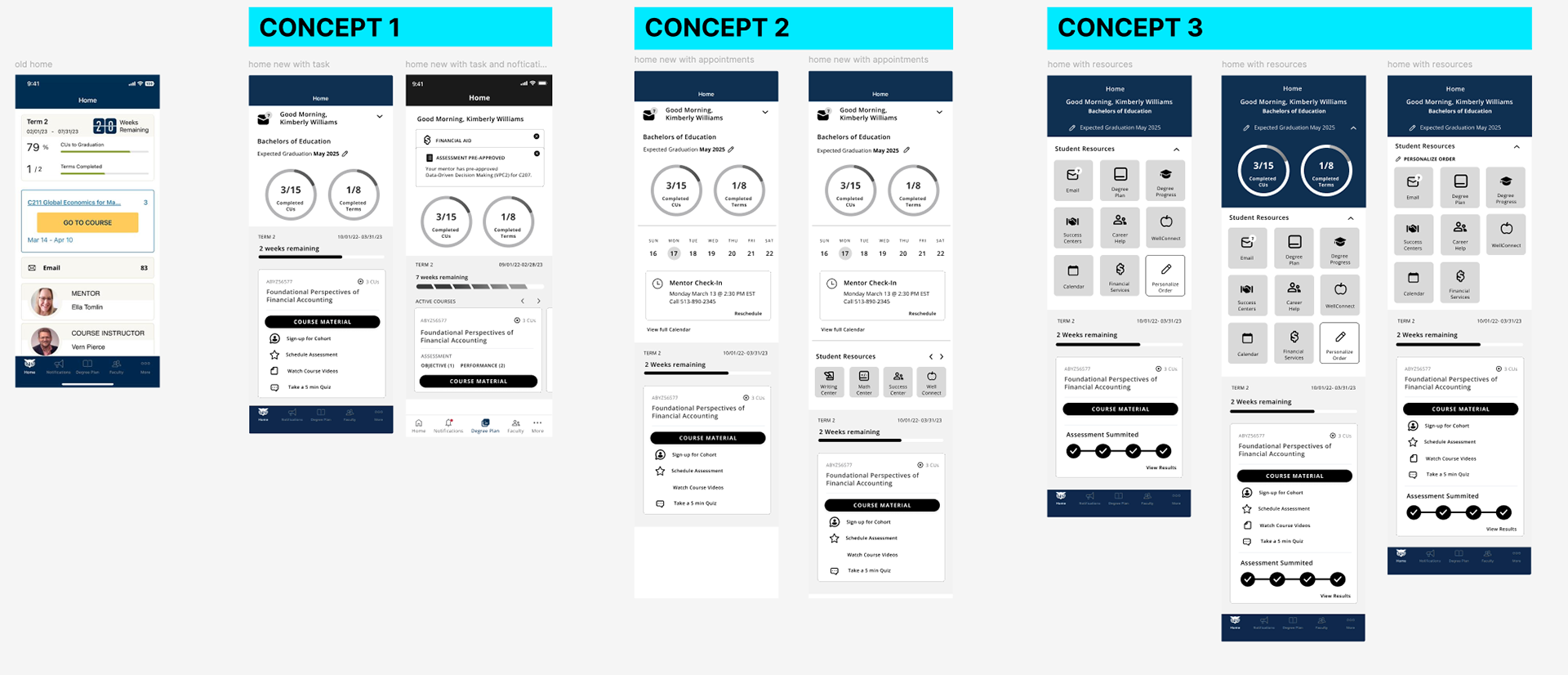
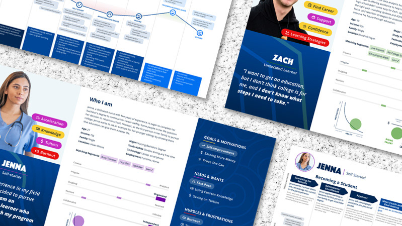
Homepage Wireframe Ideas
Wireframes were developed after reviewing analytics, heatmaps, and conducting surveys with students. Three different concepts were developed: 1. Focus on progress and coursework; 2. Focus on upcoming events/appointments; and 3. Give a variety of actions for the student to choose from. These concepts were then reviewed by stakeholders and tested with students to see which one would help with progress, and Concept 1, which focused on progress, was what moved forward.
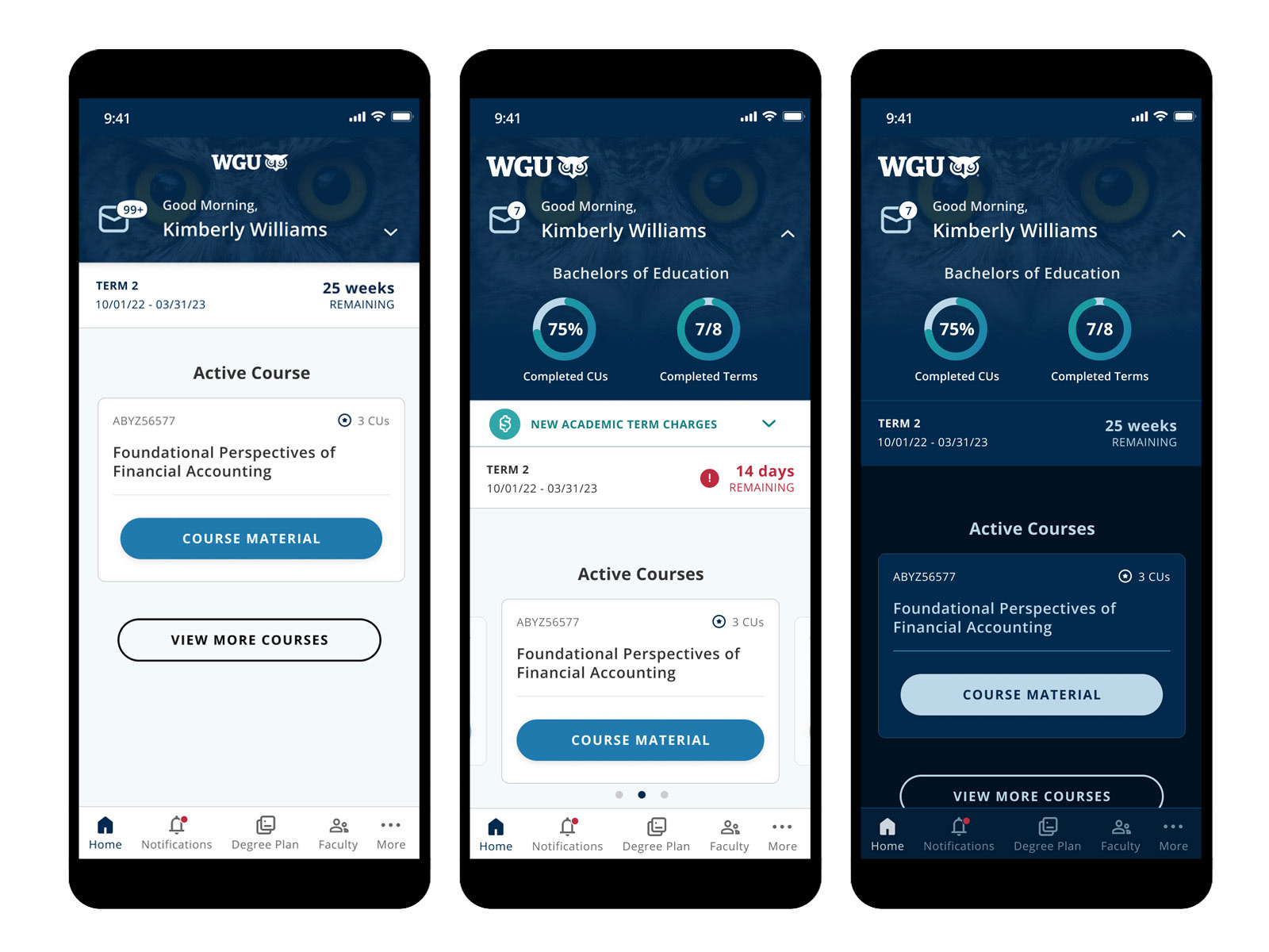
Updated Home page
Updates the homepage to focus on the current enrolled course, reducing rage taps by two-thirds by adding a collapsible and clickable progress area for students to view overall progress and term-by-term progress.
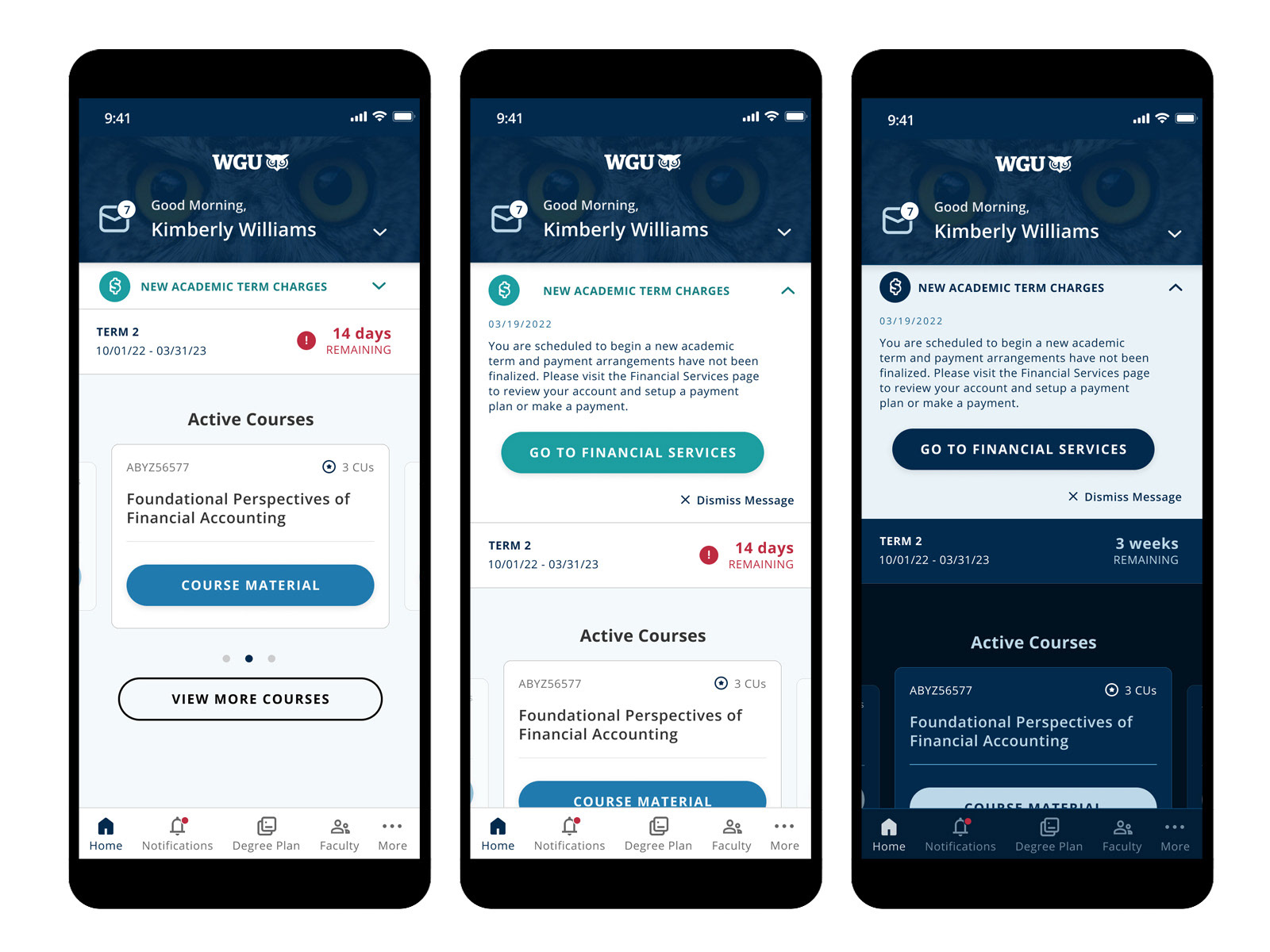
Notifications pop-up
To keep students on track, urgent tasks and alerts are highlighted right on the home screen. Highlighting important student tasks led to a 22% increase in students clicking and completing tasks.
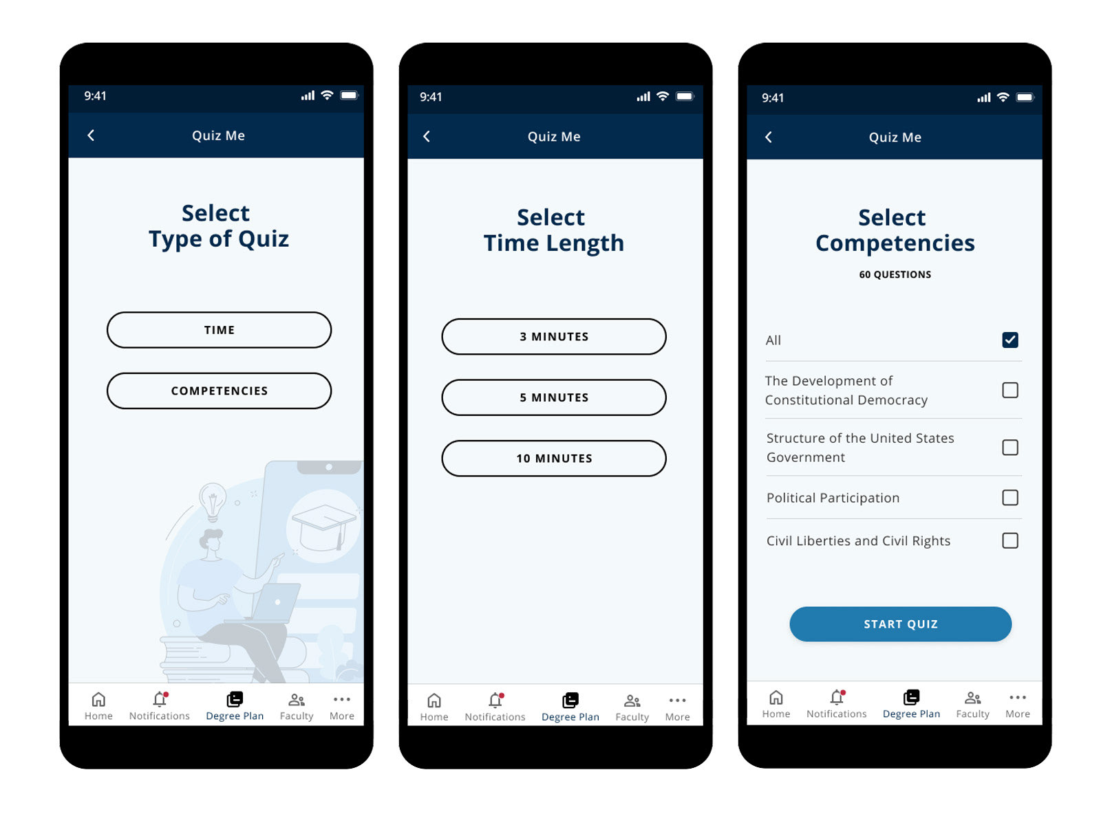
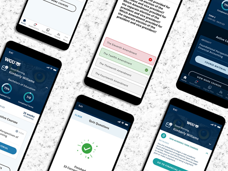
Quiz Me
Through the analysis of screen recordings, it was observed that students were relying on PDFs of completed pre-assessments as study guides. However, these PDFs were not optimized for mobile devices, limiting usability and engagement. In response, the Quiz Me feature was developed—an interactive in-app quiz tool that leveraged data from pre-assessment reports.
This feature allowed students to personalize their study sessions by selecting specific competencies or adjusting the amount of time they wished to spend studying. The introduction of Quiz Me resulted in an 8% increase in final assessment pass rates and a 3-minute increase in average time spent in the app.
.